Happy Tummies is a family owned online company. They sell food, books and kitchenware for people on restricted diets due to medical conditions such as food allergies, intolerances, coeliacs disease or just people looking for healthy alternatives with the aim of also making food fun!!
Happy Tummies promises to keep abreast of new products and offer a wide range of products suitable for people on all types diets. They have products for everyday as well as special occasions. They have numerous suppliers and are able to source any products that their customers.
Project Overview
Happy Tummies was conceived since after the owners’ middle child had been diagnosed with several food allergies. They have been in the service of helping people with special diets find healthy food. They are dedicated to informing the public the importance of healthy living. They sell educational materials and kitchenwares especially made for people on restricted diets due to special medical conditions.
Previous Website
The previous website had very enticing colors although the fonts are very tiny. The menu buttons are small. The “follow us on facebook” menu took most of the space.
BMC Solutions specialise in Joomla and often troubleshoot for clients and after our initial meeting with Nedlands Yacht Club, BMC Solutions recommended a fresh website design to market the functions side of the Yacht club which was previously in a separate website and to use WordPress instead of Joomla as we also cater to WordPress designed websites for its ease of use.
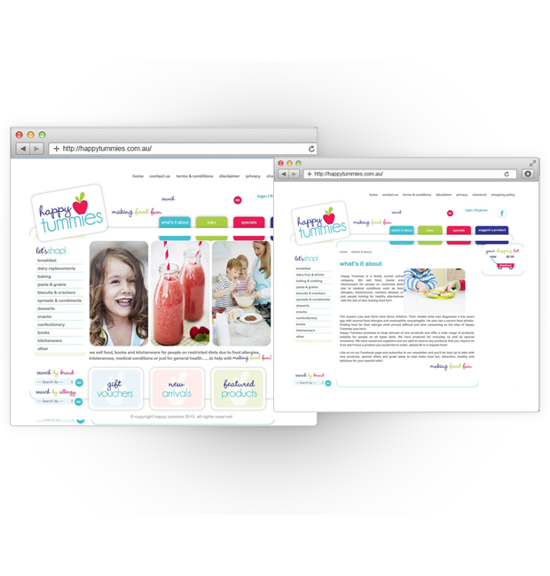
Initial Website Concepts
The BMC design team came up with the idea of making the fonts larger so as to capture the audience. The team decided to choose colors that would embody the concept of their website. It was also deemed necessary to maximize the unused spaces.
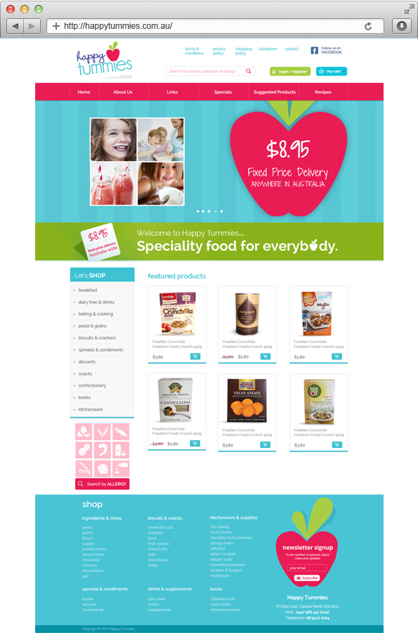
Our Solution
Since the prevailing colors are red, blue and green, the team finally decided on using blue as the background color for the header and footer.
An Easy-to-Navigate-Menu was added to the page.
The Let’s Shop corner was made more visible by making the font bigger.
A Search By Allergy Corner was made at the lower left corner of the page.
The Featured Products were made more accessible.
At the Footer, a newsletter signup corner was put in the bottom right corner of the page.
The Follow us on Facebook button is was made smaller and placed at the upper right corner of the page.
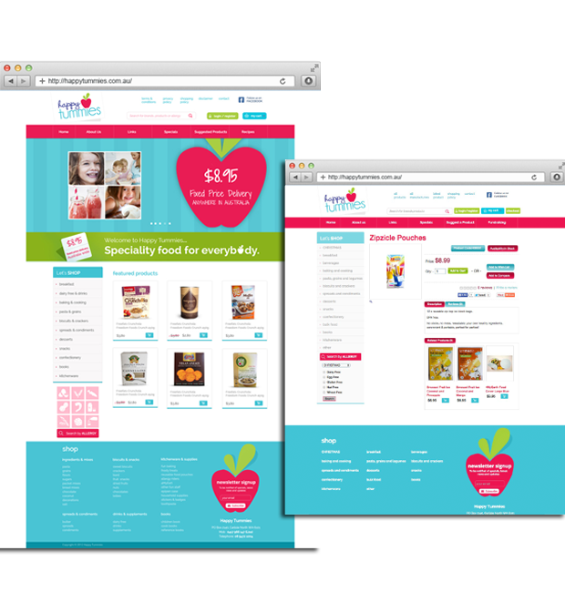
Outcome
After the implementation, the website became more readable and the layout became more pleasing. The visitors claim that it became easier for them to access the page they were looking for. Unlike the past website, the new groupings of the menu buttons made the whole page look organised..